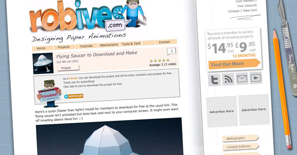
Carrying on from my tidying up of the blog post headers, I've turned my attention to the rest of the website. I'm planning on tidying up the look and feel as well as the underlying code.

My plan is to remove the notebook on the front of the website and make the website itself into a notebook. I've placed the open notebook on a cutting mat with pencil and scalpel nearby. The buttons have been tidied up a bit and I'll be calming the colour scheme down a bit.
This is the first draft – what do you think? Any requests?
++++++
If you are a member you can download a full size high quality jpeg of the proposed website layout.


